11-03-2014
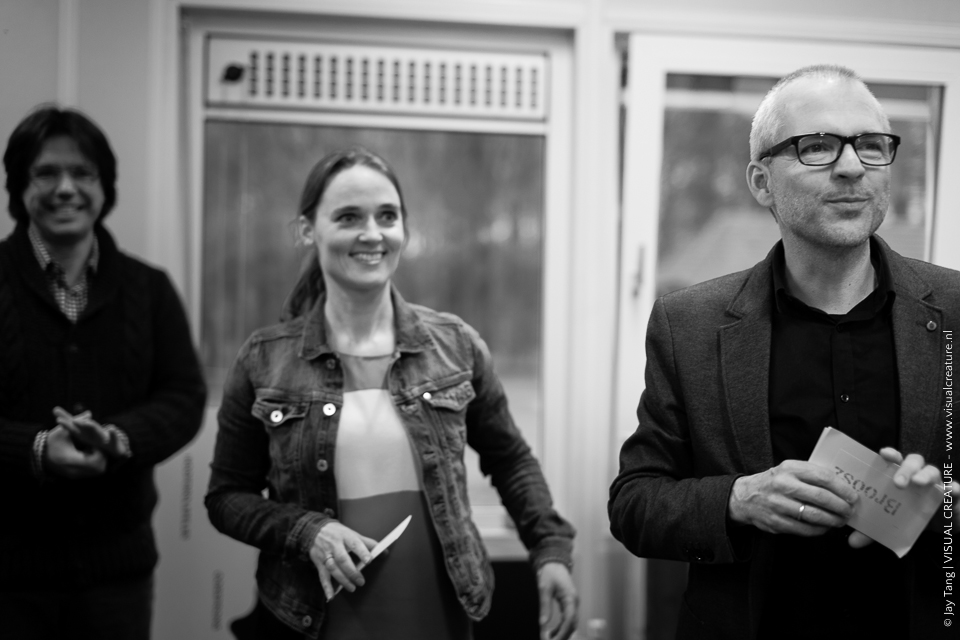
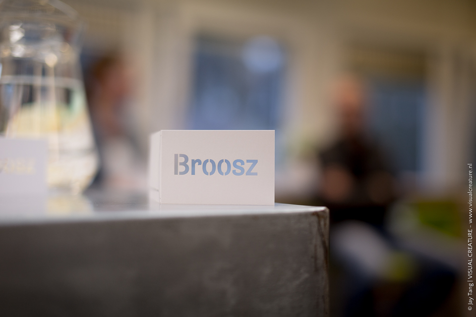
Last week was the 10th anniversary party of my client, smit kempink development, a company by Jan Smit and Georgette Kempink. That day they relaunched their company name from smit | kempink development into Broosz, a company that facilitates change management for teams and organisations. The new name is represents the process of learning new insights and gaining new knowledge. It took them four sessions in a span of a year with branding specialist Ron van Gils @ Kreationz to have found their true identity. Stings Fragile became their inspiration and resulted in Broosz, a wordplay of ‘broos’, Dutch for ‘fragile’.
It’s a bold and courageous move to do away with the company name your clients and your whole business network have known you for the past decade. It’s a testament to their drive to find their own identity and to renew themselves. In the past, they have associated their names to the company and to the work they did, but it didn’t tell what they were doing. With Broosz they have found a name that could tell their story and their way of working. The passion with which Jan and Georgette talked about their motivation and experience really made an impact on me. I could relate to their way of thinking and how they approached their clients’ challenges. I could truly connect with the new Broosz.
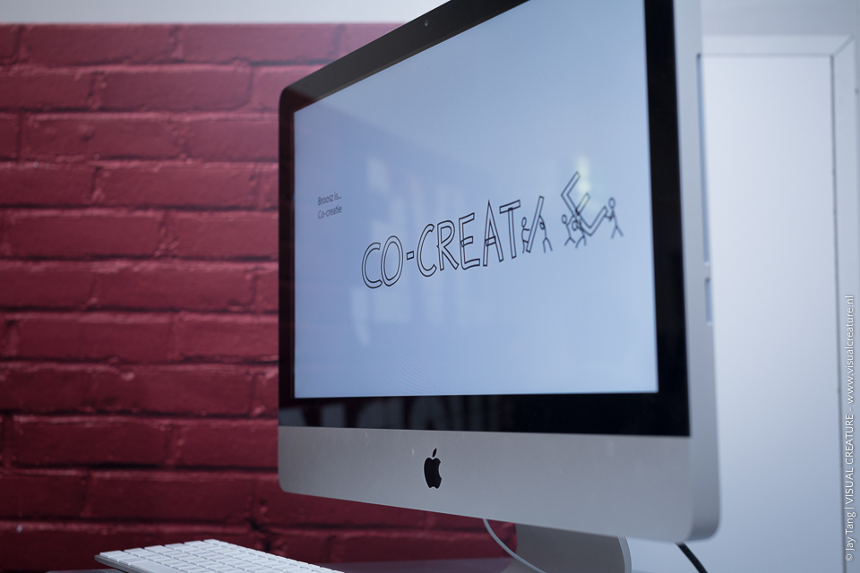
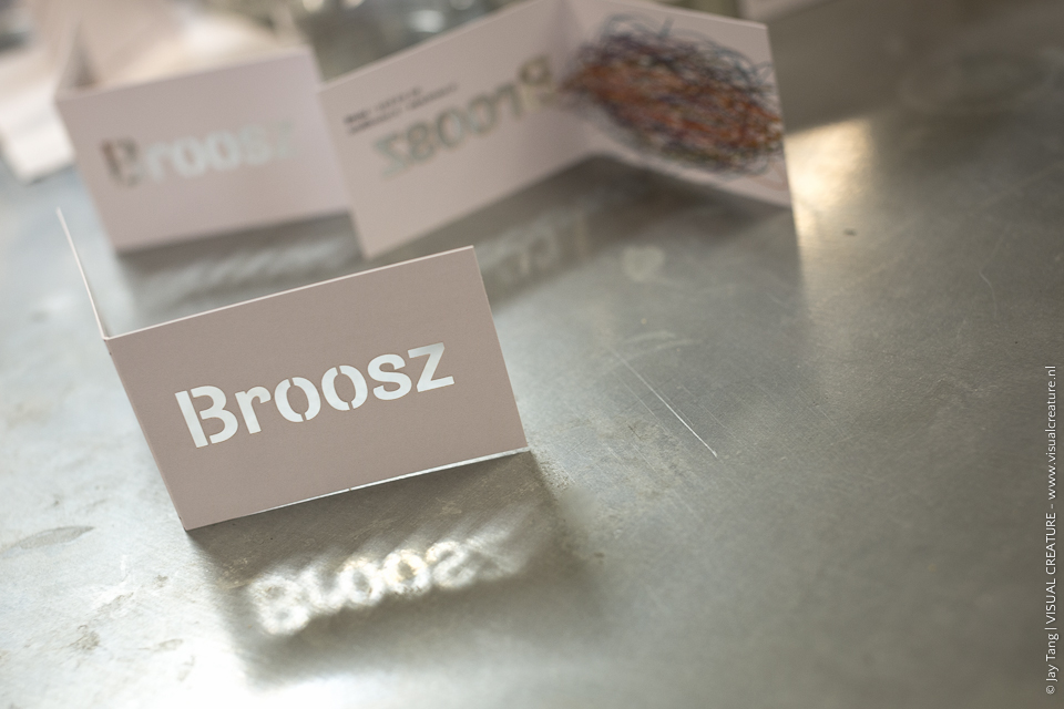
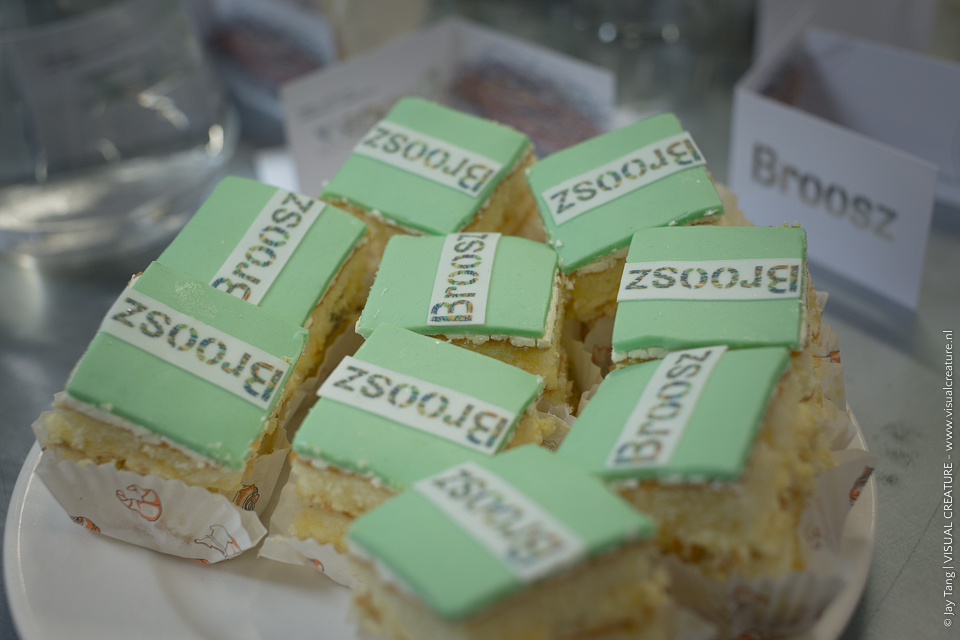
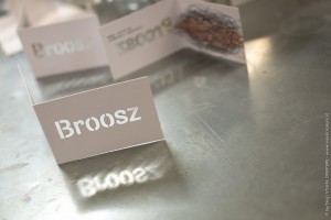
This helped our team, Dennis Maij @ WeAreBold, Remy Vledder and I, in the early design process of creating a new visual identity. We went on to create dozens of different concepts for the logo, but one set of logos stood out from the start: They were all based on the concept of ‘the process of searching for something’. Since you never know how and when you will find something, we visualised it in a chaotic, shapeless and random scrawl. We used this as the basic pattern to cut out the letters of Broosz. This led us to the idea of literally cut out the letters to create the business cards. It’s fragile yet strong, which fits perfectly with the thinking behind the the new brand name.
To further build upon the brand, we took inspiration of the famous sixties comics Love Is… by Kim Casali. In a few quotes and illustrations we wanted to tell the audience what Broosz does and what it means to be Broosz. We incorporated these quotes into the website and it truly helps communicating the new brand identity.
The client found trust in us to create something that complements their story and gave us full creative freedom to explore the possibilities. It’s a project I’m really proud of.
Dit blog is verschenen op de website van Visualcreature en geschreven door Jay Tang – maart 2014
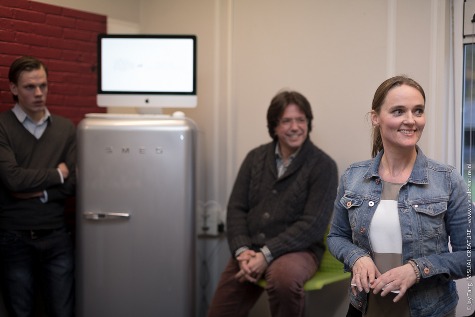
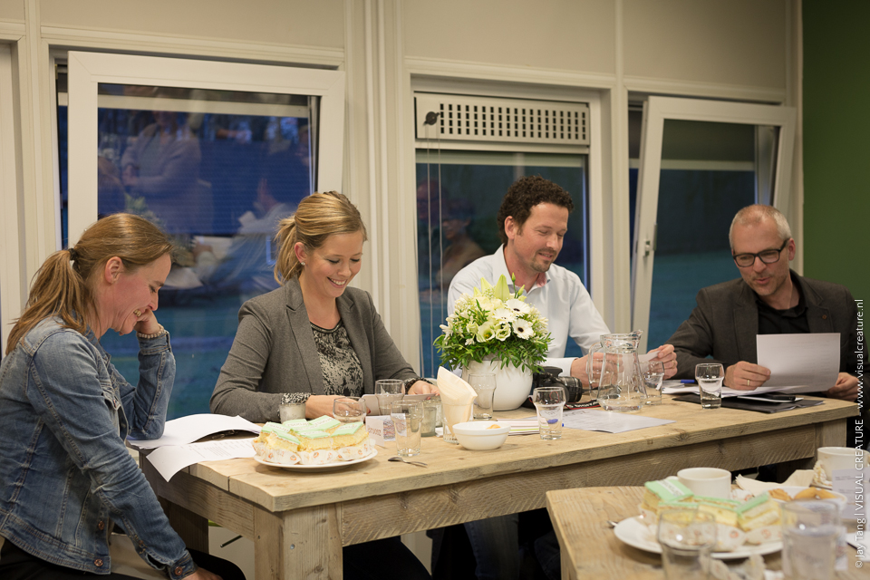
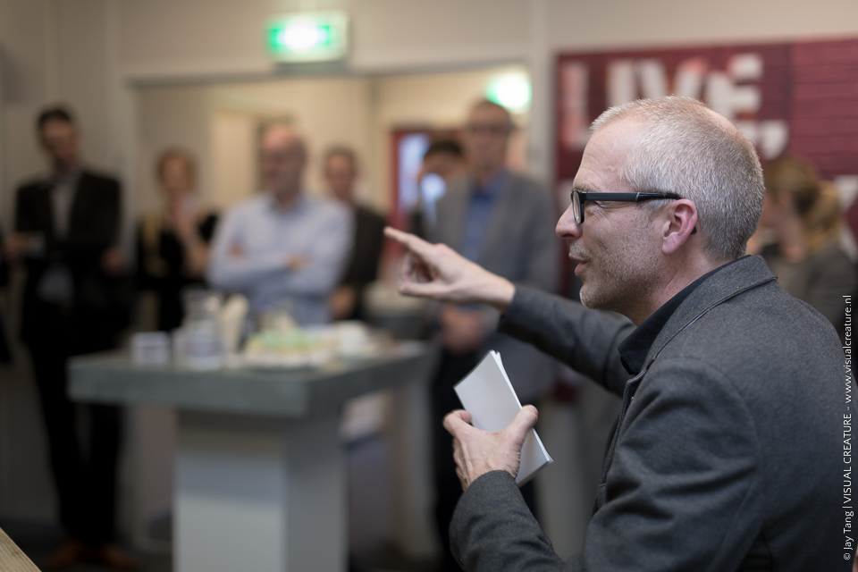
Tijdens het feest van Broosz op 13 februari heeft Jay een paar prachtige foto’s gemaakt: